In the world of interior design, a language of its own has emerged, encompassing a myriad of terms that describe the intricate aspects that shape spaces into havens of style, functionality, and ambience. Whether you’re a passionate enthusiast or an aspiring professional in the field, understanding these terms is akin to unlocking the secrets of design’s visual and emotional impact. From the balance that underlies a harmonious layout to the hues that evoke feelings, from the juxtaposition of elements to the careful consideration of lighting, this glossary serves as a guide through the terminology that is the essence of interior design. Embark on a journey that will empower you to articulate, appreciate, and apply the principles that shape the spaces we inhabit.
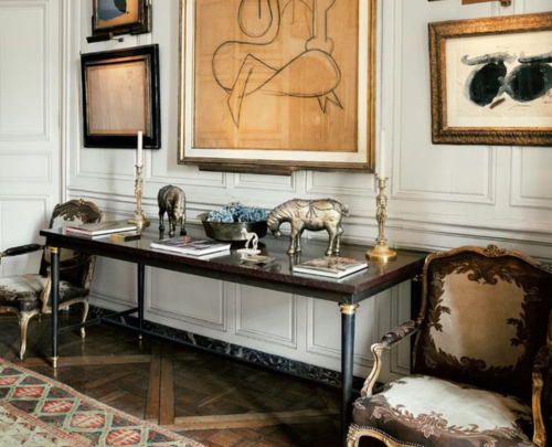
Antique: Antique pieces are often used to add a sense of history, authenticity, and uniqueness to a space. They can become focal points and conversation starters, showcasing the owner’s appreciation for fine craftsmanship and historical significance.
Alcove: An alcove refers to a recessed or partially enclosed space within a room. Alcoves can be found in a variety of architectural styles and are often incorporated into interior spaces for both functional and decorative purposes.
Atrium: A central open space within a building, often featuring a skylight or glass roof, providing natural light and a visual focal point.
Accent Colour: A bold or contrasting colour used sparingly to highlight specific elements within a design.
Architrave: An architrave typically refers to a decorative moulding or trim that is used to frame and enhance the appearance of doorways, windows, and sometimes other architectural features like columns or wall panels.
Book-Matching: Book matching is a technique in interior design and architecture that involves matching adjacent surfaces or materials, such as wood veneers, marble slabs, or even fabric patterns, to create a symmetrical and visually harmonious effect.
Credenza: This is a versatile and functional piece of furniture that is typically used for storage and display. It’s often placed in dining/living rooms and home offices to enhance both the aesthetics and functionality.
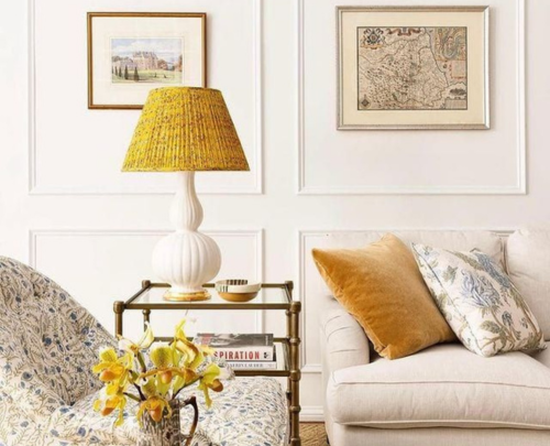
Colour Palette: A range of colours chosen to be used in a design project, creating a cohesive and harmonious visual impact.

Crown Moulding: It is a type of moulding that is installed at the junction of a wall and the ceiling, creating a visually appealing transition between the two surfaces.
Cool Colours: Colours such as blue, green, and purple evoke feelings of calmness and tranquillity.
Ergonomics: Designing spaces and furniture to optimise human comfort, efficiency, and safety.
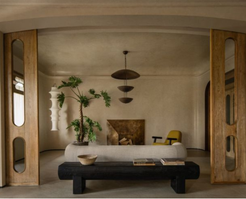
Focal Point: The main area or element in a space that draws attention and becomes the centre of visual interest.

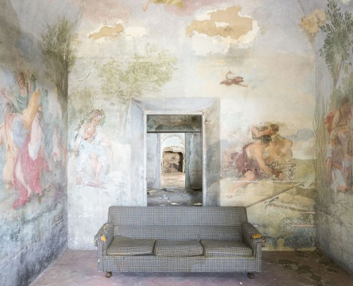
Fresco: It refers to a mural painting technique that involves applying pigments to wet plaster on a wall or ceiling. This ancient and traditional form of wall decoration has been used for centuries to create stunning and enduring works of art within architectural spaces.
Juxtaposition: Placing contrasting elements side by side to create a striking and visually engaging effect.
Lacquer: Lacquer is a type of finish or coating that is applied to surfaces such as wood, metal, or even walls to enhance their appearance, durability, and functionality.
Mood Board: A visual representation that combines colours, textures, materials, and images to convey the intended style and ambience of a design project.
Monochromatic: A colour scheme that uses variations of a single colour, creating a harmonious and cohesive look.
Open Plan: A design approach that minimises interior walls and partitions to create a more open and flexible layout.
Proportion: The relationship between different elements in terms of size, scale, and visual weight, contributes to a balanced and harmonious design.
Plinth: A plinth refers to a structural element or base that serves as a foundation or support for various elements within a space and is typically found at the bottom of columns, pedestals, walls, or furniture.

Rhythm: The repetition of design elements, such as patterns, colours, or shapes, to create visual movement and flow within a space.
Scale: The relative size of objects concerning one another and the space they occupy.
Symmetry: Achieving balance by arranging elements equally on either side of an axis, creating a sense of order and formality.
Saturation: The intensity or purity of a colour, ranging from vibrant to muted.
Texture: The tactile quality of surfaces, which can be smooth, rough, shiny, or matte, adding depth and sensory interest to a space.
Tint: A colour that has been lightened by adding white.
Transitional Space: A space that connects two distinct areas within a home, such as a foyer or hallway.
Transitional Design: A style that combines traditional and contemporary elements, creating a balanced and timeless aesthetic.
Vintage: Vintage items are used to evoke a particular era or style, adding personality and a sense of nostalgia to a room. Vintage pieces can be mixed and matched to create eclectic, one-of-a-kind interiors or to complement more contemporary design elements.
Warm Colours: Colours such as red, orange, and yellow evoke feelings of warmth and energy.
Zoning: Dividing space into different functional areas based on their intended use, optimising the flow and efficiency of the space.
As our lives unfold within the realms of architecture and design, a familiarity with the language of interior design becomes more than just a vocabulary – it becomes a passport to creating spaces that resonate, inspire, and delight. The glossary of terms presented here is not just a collection of definitions; it’s a key that unlocks the doors to creativity, innovation, and meaningful expression within the spaces we inhabit. Armed with these concepts, enthusiasts and professionals alike can navigate the intricate landscapes of design, weaving together elements of aesthetics, function, and emotion to craft environments that are not only beautiful but also deeply resonant. So whether you’re embarking on a design journey or simply seeking to elevate your appreciation for the spaces around you, this glossary is an invitation to explore the tapestry of interior design’s language and the endless possibilities it presents.